Previously we looked at the use of the colour red for the text on book covers. Today we’re going to dig into font choice, size, and placement.
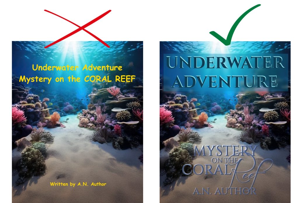
Let’s assume our author has worked out that red is not going to work on these covers. I’ve changed the “before” font colour to yellow so that we can see it a bit more clearly.
So here are the tips for improving covers like these:
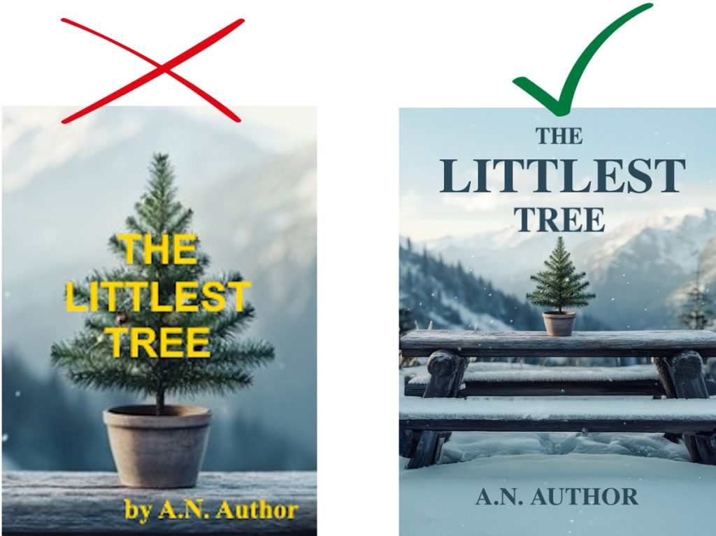
- Try to avoid system fonts. These are the ones that come standard with whatever operating system and word processing package you install on your computer, that have been used for decades by millions of home users. Fonts like Arial, Times New Roman, Verdana, and — the cheesiest of the lot — Comic Sans (the font used above on the Underwater Adventure “before” example). Some people think they should use Comic Sans because it’s a comic book, graphic novel, or children’s picture book… but, really, it’s a tired old font that’s a dead giveaway for something that’s been stuck together on a home PC. (In our “before” example below for The Littlest Tree, you can see that Arial has been used for the title and Times New Roman for the author name.)
➔ There are excellent options for downloading royalty free fonts from sites like Font Squirrel, or you can pick from Adobe’s suite of fonts if you subscribe to their products. Sometimes it’s a subtle difference but it’s the overall impression of professionalism that your potential buyer is getting from your font choice.
- The size of the text. Everything in our example above is way too small: the series title, the book title, and the author name. You don’t have to squeeze the entire title on one line. Take up space. Make your name big and bold.
- Likewise, everything in those top two lines is the exact same size. Look at how a variation in sizing creates a different effect in the “after” example.
- Line spacing. The person who create the “before” cover above just pressed the Enter key after “Adventure” and went with the automatic line spacing that occurred. Compare this to the “after” example – do you see how tightly those three lines are hugging each other? It makes the title feel like a cohesive whole. This is achieved by placing different pieces of text in different layers in the graphics program and then moving them around separately until you achieve a placement that you’re happy with.
- Ditch “Written by” or “By”. When there’s a name on a cover, it’s already presumed that’s the author’s name. If you have an illustrator you want to credit on the cover, that name can be in a slighter smaller font with “Illustrated by” in front of it, but the author’s name stands proud, bold, and alone. No qualification necessary.

- I’ve mentioned Arial and Times New Roman already, but another consideration is mixing serif fonts and sans serif fonts on the cover. It can be done, but you need a really good eye. When in doubt, go for a serif font as it gives the cover a little more sophistication.
- The same goes for mixing upper case and lower case.
- Using two many different fonts is another decision that can make your cover look less professional. Try to stick to one or two.
➔ In our “after” example for Underwater Adventure, the word “Reef” is highlighted by being in a very different font and in initial caps and lower case.
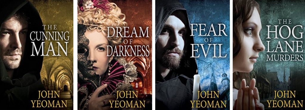
- And, finally, vertical placement. Centred is usually a good idea, but you can take into account the way your image is placed on the cover – if most of the image is to the left or right, then you can place your text to the side. You can see this done beautifully below in my late colleague John Yeoman’s books, where the left-image, right-text gives these books the feel of being part of a series, even without a series title.
➔ In the “before” example of The Littlest Tree above, though, there’s no purpose for the author’s name to be shifted to the right, so I would suggest it’s just centred.
The best way to learn is to study dozens and dozens of book covers and work out what you think works and what doesn’t. Then apply that to your own covers. Eventually you’ll develop a really good eye for it.
📷Mock-up book cover backgrounds: Adobe Stock. Designed by Elle Carter Neal.

Elle Carter Neal is the author of the middle-grade chapter book The Convoluted Key, picture book I Own All the Blue, and teen science-fantasy novel Madison Lane and the Wand of Rasputin. She has been telling stories for as long as she can remember, holding childhood slumber-party audiences entranced until the early hours of the morning. Elle decided to be an author the day she discovered that real people wrote books and that writing books was a real job.
